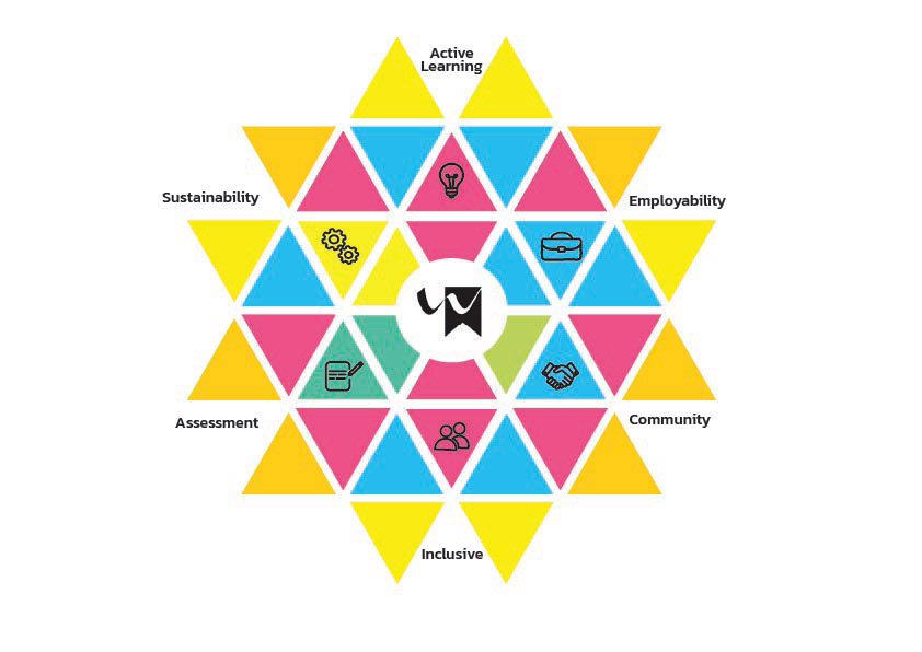
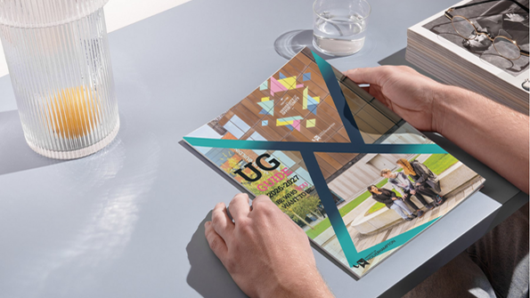
My concept was made to integrate elements of the university's brand, drawing further inspiration from it’s current logo. I’ve worked the triangular shapes from the brand into my own idea, creating a visually interesting kaleidoscope of colours. This visual approach plays on the metaphor that each student’s journey and story is entirely unique, like the patterns seen through the lenses of a kaleidoscope. Each student's has their own journey, filled with their own personal experiences and opportunities, which I highlight through the design, coming together to form a star of community, giving a voice and meaning to the infographic.
For the typeface, I selected Kanit, a sleek and modern font that presents uniformity and sophistication. Its clean and uniformed design allows accessibility across various platforms, ensuring that the message is clear and engaging for the wider audience of students. Kanit gives off a sense of timeless quality, increasing the infographic’s longevity as a whole. Its professional and polished appearance aligns with the university's brand identity, providing both a sense of consistency and approachability.